Rogue Racing Mobile
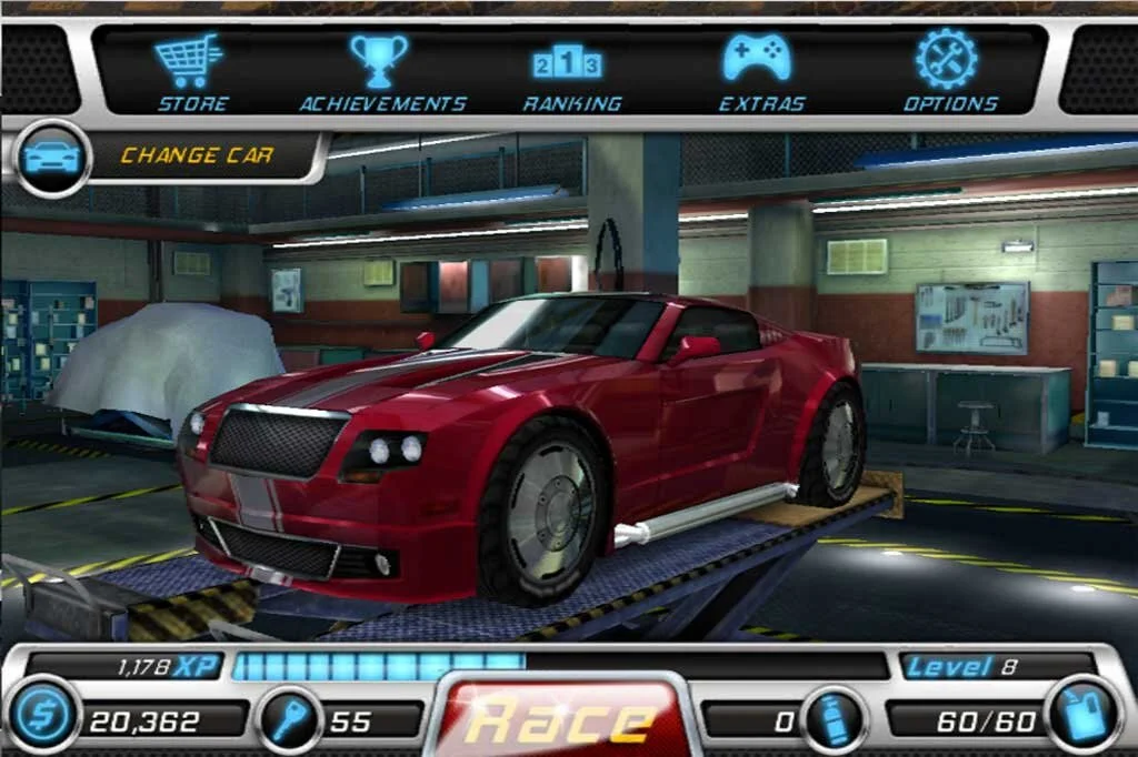
Tasked with revising a cluttered and confusing UI, a majority of the time on this project was stripping out and removing unnecessary information. The other was giving a fresh coat of paint to the game while not straying too far from what was seen in the original.
Main Menu
When game design team started eliminated certain mechanics it became easier to distill down to a streamlined UI. Simple things like changing the button and text color to match the different types of currency helped break up the homogeneity that was seen in the original.
ORIGINAL
REDESIGN
Store
The original Store menu was overloaded with visual information and suffered from the following issues that were alleviated by creating a more streamlined design.
Items for sale were crowded by text, graphic elements and prices.
The position of the "Back" button was awkward and pointed out negative space.
The "Preview" button was hidden inside a pop-up after clicking "Buy".
Flavor text was also hidden inside the pop-up.
ORIGINAL
REDESIGN
Results
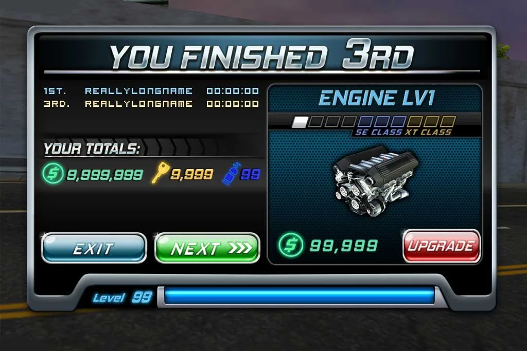
Appearing the end of a race, the original Results screen suffered the same problems as the two examples above - too much information that doesn't provide clarity or better serve the player.
In the update, information is distilled down to the most important pieces - the player's position, player time vs. the top opponent, and current running total of currency and pickups. The XP bar (removed from the previous HUD design) was integrated onto the window itself and the upgrade window (once just a reminder) now functioned without the player leaving the race.
ORIGINAL
REDESIGN


