Echo VR
Affectionately called, “Space Frisbee” by some fans, Echo VR is a competitive multiplayer game where two teams try to score points with a disc in zero-g. While this product has the appearance of being standalone it is not. In fact, Echo VR was a game mode in the singleplayer game Lone Echo before it was split apart. But when the split was made Echo VR retained the UI art, UX, and technical debt from Lone Echo.
Create & Join
Adobe XD prototype: Deeplinking
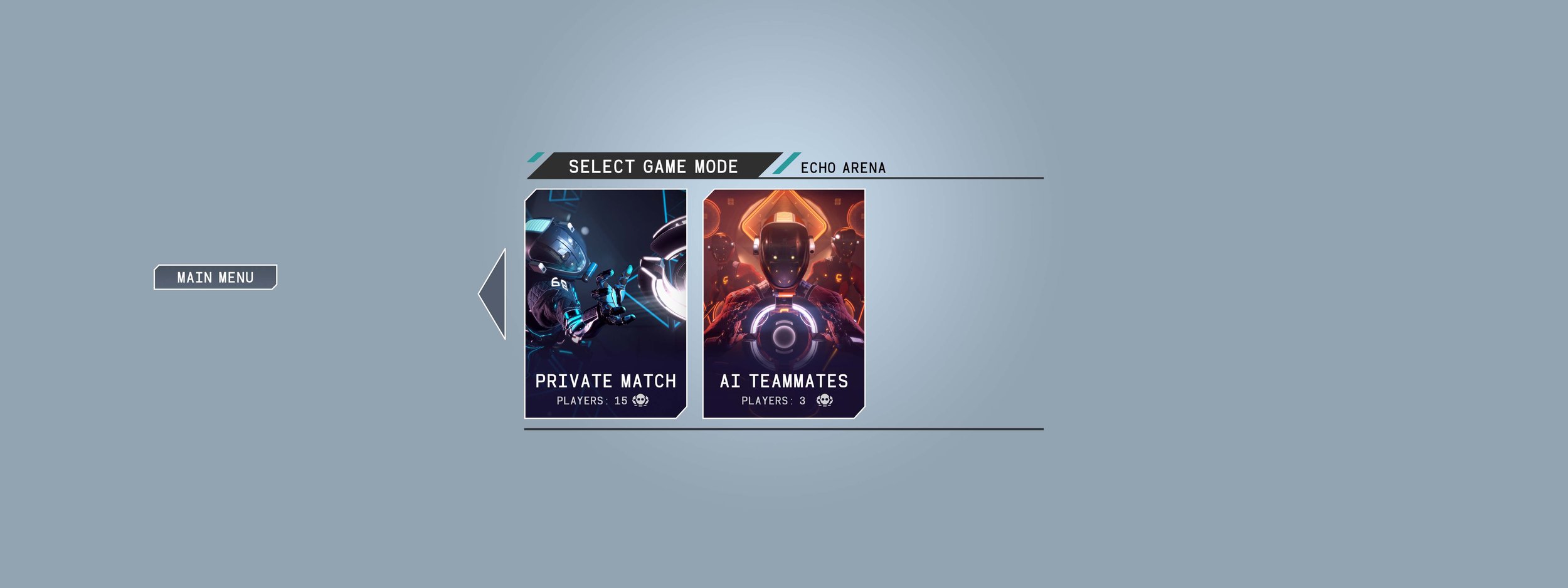
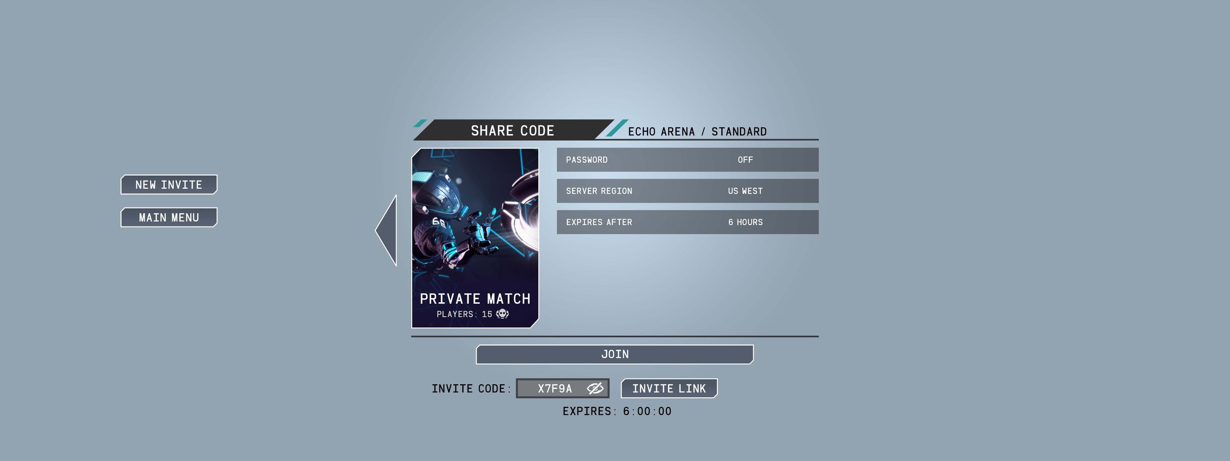
The goal of this feature, referred to as Deeplinking, was to create a way for player to create and join games easily. However, the original wires that game design created in Powerpoint were confusing, too technical and downright ugly. Seeing an opportunity to splash on a new coat of paint, fix bad UX, and eliminate technical debt, I championed a dramatic design change to simple wizard-like flow that uses big, colorful cards.
While other designers may have shied away from such sweeping changes, I evangelized to leadership and fellow teammates to execute my vision.
Old vs New wireframes
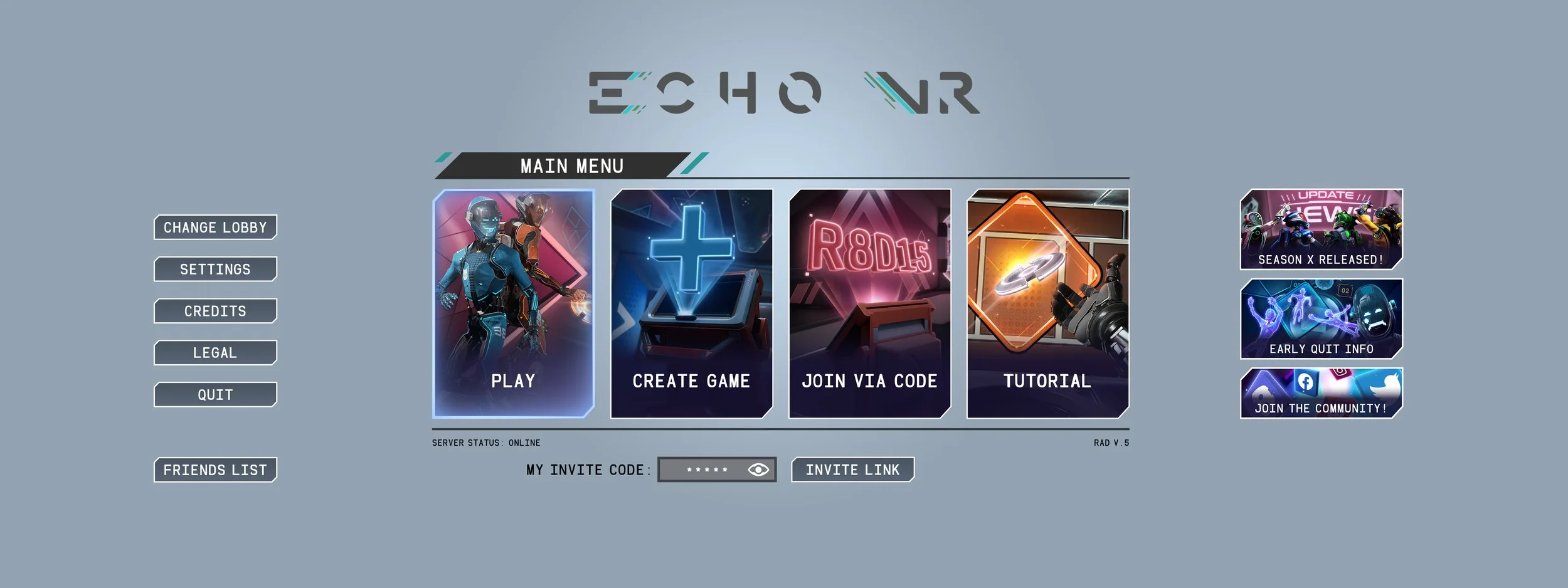
Main Menu Cards
There were few options to impact the visual design, but one place was the Main Menu cards. After creating sketches and rough comps of my concepts I pitched them to teammates and directors. Once approved, I scheduled an in-game photo shoot with QA volunteers who played as “actors”. From behind the camera I shot and directed the actors to get the right look and enough coverage to turn the renders into final cards.
Sketches
Final art
Future Frontend
Adobe XD prototype: Future Frontend Launcher
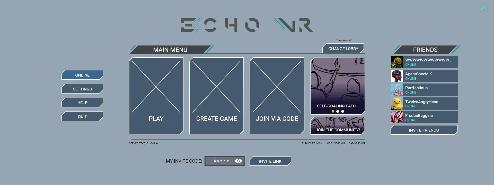
Before I took over UX/UI responsibilities different buttons and information had been added without much thought or organization. The mentality was “just get it in there”. So, after the Main Menu update was released I started prototyping more visual and flow changes to the Frontend. These changes would include reorganizing menus on the left into tabs, auto-carousel News card, a visual list of Friends, and additional card buttons to unify the visuals. My goal was to create a more scalable design that could funnel new requests into the right menus without overhead. The work paid off as the very next feature was adding a Report Issue button which was immediately added to the Help tab.
Report Player
Adobe XD prototype: Report Player Launcher
Because Echo VR is an E-sports game bad sportsmanship and other kinds poor behavior were more likely to happen than not. The goal was to add in a Report button so players could quickly select the “bad actor” and then choose a reason. While I identified more clever ways to report player in VR after conducting competitive research, the team was stuck using existing systems.
There were two places that the Report button would be accessed: the Pause menu and the player’s personal iPad called the “Arm Computer”. I created a prototype that captured both flows and layout variations the report button’s location in the expanded player details of the Arm Computer.
Arm Computer interface with expanded player details
Early Quit
Adobe XD prototype: Early Quit Launcher
Throwing a VR disc into a goal or to another player requires a good deal of physicality and finesse. If you are on a team can’t compete against other more experienced players? Quitting rather than sticking it out with teammates is a tempting option!
Originally game designers proposed an increasing frequency of punishments for “early quit” players. But I countered by proposing we decrease the frequency of punishments and offer up a cosmetic reward instead. “Loyalty” ribbons & titles would be earned when players play until the match is over, encouraging sportsmanship. This, softening the language of warnings, and adding progress meter were embraced into the design.
Loyalty Rating Pop-up
Report Issue Flows
When the Report Issue was presented to me by Live Ops devs it was merely “adding a button” into the menu. But being a champion of the player, I wanted to know more.
Facilitating conversations with Live Ops and the community manager, I learned that players were dumping reports of crashes, critical game questions, and beyond into dedicated Discord channels. From there it was up to devs (and community members) to address each by hand. The solution to all this was to utilize Zendesk, but Live Ops was struggling to sell the investment to leadership.
Partnering up with Live Ops, I mapped out the current vs future reporting flows to succinctly communicate why this investment was necessary. The visual flows sold the solution because everyone could now see exactly what the investment would solve.
Current vs Future Report Issue Flows


